Showing posts with label brushes. Show all posts

Sunday, December 18, 2016

Painting the Outback in Oils

Painting the outback.

Ayer’s rock, or as it is known “Uluru” is not only one of Australia’s major landmarks but also it is one of the most sacred and important aboriginal sites. I travelled to the “Red Centre” of Australia in the Northern Territory couple of years ago, and visited some of the most beautiful places I’ve been to so far.

In this painting I wanted to show the vastness of the land with this massive sandstone monolith occupying a dominant position in the painting. A big sky will complement the subject.  


Above is one of the reference photos I used for this painting. I also prepared some sketches (to scale with the canvas) and then I chose the one that I liked most. Following that on my notebook I did some planning of the colors to use and of the various color values. To do this I use a value comparative which helps me a lot to judge my values correctly. My aim is that during the first phase of the painting I get as much as possible close to the end product in what has to do with values and color. Then when the canvas is entirely covered with paint I will be able to judge by comparing one color to the other next to it and adjust accordingly.

For myself the first stage of the painting is the most important one and most labour intensive. By the end of this stage I will need to have all the canvas covered with paint and establish shapes and form of most of the elements. I also try to get as close as possible to the right tones and values. By the end of this stage I want to see most of the painting only lacking detail and minor adjustments. Since the sky plays a very important role in this painting, I decided to start from the sky by blocking in the clouds leaving empty spaces for the sky. For the sky I usually use an old big brush so that I can literally scrub the paint all over. When painting the sky I try not to paint it as a solid object always keeping in mind that I am painting air. 

The next step was to block in the foreground and the rock itself. The main rock formation was painted using a mixture of cobalt/ultramarine blue, white and Quinacridone Magenta. Using a cloth I softened edges and lifted paint of to expose the underpaint while establishing where to place the highlights in the next step. 


 The next stage was to start adding the details. Using various mixtures of white with burnt sienna, cadmium scarlet, alizarin, yellow ochre and ultramarine blue, I gave more form and detail to the ground at the front and middle parts of the painting, giving the impression of cracked ground washed away by water. More form, details and highlights were added to the trees and bushes all across the painting. Using a warm and cooler version of the base mixture described above the details and highlights were added to Ayer’s Rock. Reflected light from the sky was painted using a mixture of white with ultramarine blue.  
Gradually I always do some minor adjustments and add more details during the first couple of weeks until I see that there is nothing else to add. 


Tuesday, August 18, 2015

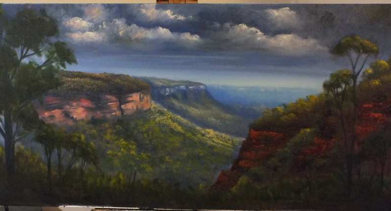
Nellies Glen Lookout

Couple of months ago, on a Sunday afternoon, we went for a short drive up to the Blue Mountains and somehow we ended up at a location known as Nellie's Glen. The place is very close to where Explorer's Tree is found, just before you enter Medlow Bath and where one also finds the beginning of the six foot track. The day was warm but cloudy with the occasional shower and thunderstorms, just a typical summer afternoon.What inspired me in the scenery was the intermittent light coming from the broken clouds, especially the warm afternoon light.
 
Materials used:
  • 45 x 90 cm stretched 10 oz cotton canvas
  • Brushes: Flat 10 - 12 for underpainting. A selection of long flats, 4,6,8 and long filberts 2 & 4
  • Oil paints (Art Spectrum, Landgridge, Norma), liquol for underpainting, Langridge Oleogel:
Titanium/zinc white, sap green, Burnt sienna, Australian red gold, Australian grey, raw and burnt umber
Blues: Ultramarine Blue, Cobalt blue, Manganese Blue
Reds: Permanent alizarin, Pilbara red, Vermilion, Indian red
Yellows: Lemon Yellow, cadmium yellow light,  cadmium yellow medium, cadmium orange, yellow ochre

Under-painting (Blocking in)
First I sketched briefly the outline of the main shapes in the painting. From the photos that I had as reference I completely changed the foreground of the painting by adding two trees one on each side of the painting. Using a very diluted wash with liquol the main shapes were blocked in. Liquol (Art Spectrum) is similar to liquin and helps the paint to dry very quickly.

Blocking in the main composition

The next step was to start establishing the form and light. As shown in the picture above initially I was going to place the light source as if it is coming from the right hand side (as seen by the highlights on the right front tree). However I changed the direction of the light later on to the middle part. Since the sky was pretty much grey and cloudy it was very difficult to see where the sun was. I also started adding some clouds using a mixture of ultramarine blue, permanent alizarin and raw umber. At this stage I use big flat brushes to quickly cover the canvas and avoid the temptation of fiddling too much. I also found that the colors I used initially for the underpainting were a little bit too light and so I darkened the overall picture, with the exception of where I wanted the highlights.


Establishing form and light


Mid- and fore-ground
Now the real work and fun started...adding the details. I wanted this painting to have lots of details, after all I love detail. From here on wards I used smaller brushes usually very long small filberts (Art Spectrum series 1100 brushes). These brushes are excellent, they keep their shape and they are relatively soft making it easy to apply layers of colors by softly touching the canvas. I started using the gel medium from Langridge, which gives more texture to the paint while at the same time makes the paint flow easier on the canvas. The rock formations on the right hand side were painted using a painting knife and a mixture of Pilbara red, ultramarine blue, vermilion and burnt sienna.
Cliff faces of distant mountains were painted using white and Pilbara red (tinted with more white for the most distant ones). Yellow was added to highlight objects directly hit by sun while for objects lit by day light, white was added to the base color.
As in any other painting, distant objects are less defined, lighter and cooler (more blue added) when compared to the ones closer to us. Nearby objects are well defined, darker and warmer.
I also used what is known as negative painting to define better objects like the front tree on the left. Using a slightly darker version of the sky (or background) colour, I painted over parts of the foliage to open up space and define more branches.
The finished painting


Sunday, July 19, 2015

The end of another day (acrylic painting)

I am going to demonstrate a different style of painting, this time painted in acrylics. One of the main differences between oils and acrylics is their drying time. Acrylics dry up by evaporation of water while oil colours react with the air in what is known as oxidation. The fast drying time of acrylics can be of a disadvantage but also of an advantage. It is an advantage if I want to paint several layers of very thin paint (glazing) without having to wait for a long time for the previous layer to dry up. Atelier Interactive acrylic paints are not only especially formulated to prolong their drying time but also they can be reworked after couple of hours if becoming wet again after the paint was already touch dry. This helps you to blend colors into each other in a way similar to oil colors.
The subject of this painting is a sunset and view over a typical Australian farmland. Painting sunsets is fun creating a lot of interesting colors in both sky and land. I decided to keep the colors as much as possible vibrant while making the best out of the complementary colors. Red, green, yellow and purple/violet are the main colors used in this painting.


Materials used:
  • 101 x 50 cm stretched 10 oz cotton canvas
  • Brushes: Normal 1 inch and 2 inch house painting brush, selection of medium and small flat Taklon brushes
  • A selection of painting knives
  • Color palette (Atelier Interactive Acrylics & Derivan Matisse):
Titanium white, Olive green, burnt sienna, raw sienna, Burnt Umber, brilliant violet, dioxazine purple, Payne's Grey, Pthalo green
Blues: French Ultramarine Blue, Pthalo Blue, Cobalt blue
Reds: permanent alizarin, Brilliant Magenta
Yellows: Naples Yellow, cadmium yellow light,  cadmium yellow medium, cadmium orange, vermilion

Under-painting (Blocking in)
For this painting I decided to use a vertical canvas, unlike most landscape paintings. The horizon line was set to slightly above the middle part of the canvas. When painting sunsets, one needs to remember that the warmest colors are those around the light source, in this case the setting sun. The further we go away from the sun the cooler it will become. The easiest way to remember this is to look at the color wheel, take cadmium yellow light as the warmest color and just move anti-clockwise towards the purples and blues. This order needs to be followed when painting both sky and land.
The first layer of underpainting was done using a 2 inch house painting brush with not too thick but neither too thin layer of color. Cadmium yellow light was used for the area around the sun, followed by cadmium yellow medium, vermilion, permanent alizarin and ultramarine blue with the addition of alizarin at the top.
Starting from the most distant land mass using horizontal brush strokes and using a tint (with the addition of white) of brilliant violet plus some cobalt blue. As progressively as I advanced into the middle hills, I increased the amount of permanent alizarin, ultramarine blue and dioxazine purple. To the darkest part at the front I also added burnt umber with ultramarine blue.
The next step was to start adding more detail and form to the sky and landscape. This time I wanted to apply a very thick layer of pigment and to do so I started adding pure color directly from the tube onto the canvas and mix the colors on the canvas itself. I also decreased the size of the flat taklon brush to 1 inch. The sun was painted using white and cadmium yellow light. In the same order of colors as used for the underpainting I started to add more pigment and moving the pigments into each other using the sides of the flat brush. I also started adding the next darker color into the lighter one to create the impression of clouds and shadows in the sky. Since the darkest upper part of the sky seemed to look like a dark cloud, I added brilliant magenta to underside of the cloud or the area where the sun hits. 
I space in the cloud was opened to give the impression of broken clouds, by painting the sky with a mixture of Pthalo blue and white.
Lucky accidental brush strokes that gave the impression of clouds or the broken sun itself, played a significant role in the development of this sky. 

Mid- and fore-ground
The next step was to start adding more detail to the land starting from just below where the sun is. Along the horizon line I started by adding cadmium orange followed by alizarin and magenta, especially to the central part underneath the sun.
The glow on the ground of the two fields in the middle ground (on the right) was painted with Naples yellow with touch of olive green. White was added to the more distant one.
The trees in shadow were painted using Payne's grey plus some cobalt blue to the distant ones or else with the addition of some Pthalo green to the closer ones.
Using a painting knife I painted the grass on the closest hill using a mixture of ultramarine blue, cadmium yellow medium, alizarin and red gold. Burnt sienna and burnt umber were also used for the ground at the front.
Finally I painted the sheep, blocking them with purple and highlighting them with Naples yellow, titanium white, alizarin and a touch of cadmium yellow/cadmium orange.

I find sunsets very inspirational due to their colors and drama, especially if the sky is cloudy. I named this painting "The end of another day", because I find that the time when the sun sets behind the horizon is also a time of reflection. When the sun sets marks the end of another day, meaning another day less from our journey of life on this planet. It is a time to think about the importance of time, since very day, minute and second that passes we cannot get it back. So it is very important that we use every second of our life wisely.

Saturday, January 31, 2015

Painting Blue Mountains


I did this painting from a photo taken at a location in Blue Mountains.
Colours used:
Cerulean Blue, Cobalt blue, Ultramarine Blue, lemon yellow, cad yellow light, yellow ochre, burnt sienna, burnt umber, rose madder genuine, alizarin crimson, titanium/zinc white, vermilion, viridian, Australian red gold.

I started with the underpainting, where I used pure gum turps to dilute the paints.
I mixed first grey by mixing equal amounts of cobalt blue and white, rose madder and touch of lemon yellow. From the darker colour I also mixed two tints. 

Using a mixture of burnt umber and ultramarine blue I blocked in the rock on the left while the front grasses on the right and foliage were blocked using a dark mix of burnt sienna and viridian. 

Another grey (ultramarine blue with some white, vermilion and touch of yellow ochre) was used for the tree trunks. 

I then blocked in the background using the first grey starting from the darkest color and using the lighter tints for the more distant cliffs.

The sky was done using various combinations of lemon yellow with white to the areas from where light is coming and a mixture of cerulean blue and touch of alizarin to the left hand side area.

I left the painting to dry a little bit for around an hour, since I used turps the paints will dry quickly and becomes tacky. 

The I started from the back adding details and highlights. I used a mix of white with lemon yellow and madder, from which I prepared two tints. The lightest tint was used for the background grasses on the top of the cliffs, getting darker as I move forward.

Using a palette knife  and the same colours I added the trees in the background on the side of the cliffs. The distant trees where blended using a mop brush to soften the edges. 

Using the darkest background colour, and by adding some white to it, with a horizontal brushstroke I added the cliff faces in the shadowy area of the closest cliffs.

The other cliffs were added using a mixture of white and rose madder.

Highlights and more details to front trees were added using cad yellow light/viridian and for the foliage shadow burnt sienna/viridian with alizarin.

Highlights on teh front tree trunks where added using a mix of white with cad orange.

The lighter part of the rocks were added using various mixtures of yellow ochre, alizarin, ultramarine blue and burnt sienna.

Monday, August 18, 2014

Fire and Water - Abstract painting


Acrylic colors used (Atelier and Matisse): 

Alizarin red, cadmium red medium, phtalo blue, ultramarine blue, Naple's yellow, cadmium yellow medium, titanium white 

Brushes:

A normal 2 inch house painting brush, brushes used to apply gesso, a painting knife

Methodology:

This was a very simple abstract I did recently on stretched canvas. I started by placing directly on the canvas ultramarine blue, alizarin and Naple's yellow. Using a 3 different brushes (one for each color) I started spreading the three colors on the canvas mainly at three distinct areas, blue at the bottom right corner, red the upper left and yellow the central to upper right corner. Carefully I started blending the colors together to create the secondaries i.e. green, purple and orange, leaving some areas of pure primary color. I left the colors to dry for couple of minutes  and then I started applying cad red, cad yellow and phtalo blue onto the previous layer using bold brush strokes and applying circling motion depending on how I was seeing the colors developing. I left untouched brush strokes that looked good to the eye or any secondary or tertiary colours that appeared by co-incidence. 
To finish off the painting I took a piece of tissue and placed it in titanium white and I applied it to some areas as a highlight. Using a painting knife I mixed blue, yellow and white and  I applied vertical strokes to the right bottom corner to look like reflections of color.


Thursday, July 31, 2014

How to make your own glass palette

Glass palette


During the last couple of years I tried several different kinds of palettes that are available on the markets starting from the traditional wooden ones to the most recent disposable ones. Depending on the situation and where I am painting all types of palettes have their own pros and cons. For example I find disposable palettes convenient because I do not need to clean my palette afterwards, but they are very inconvenient if I am painting in the wind. When I do not have a lot of space where to work and put things around me I usually use a big piece of perspex which fits exactly into my French easel and so I can leave the colors on it ready for the next session or even put in the freezer to be used couple of days after.

Recently I decided to start using a glass palette, that is big in size and that I can take with me when I go to workshops and painting outside. The size of the palette is approximately 55 x 35cm and it is simply made up of a piece of normal glass painting at the back in grey with acrylics. The grey color helps you to see the colors much better since it reduces reflections. From the local store I bought the wood and piano hinges I required to build the wooden case myself. I then fitted this piece of glass into a home-made wooden box which I can close and lock when it is not in use and during transport. When open I can place the whole box on the drawer of my French easel. The open lids serve as small side tables on which I can place my colors, mixing media and brushes. I also fitted a wooden brush holder on the side.

When ready I simply transfer all the brushes into my French easel, place colors in their box and clean the mixing surface with a clean tissue or cloth. Being made up of glass makes it very easy to clean. The advantage of a big palette is a larger mixing area as well as enough space to place your colors around. I always place my colors in the same order as they are on the color wheel, that is reds on my left, blues on my right and yellows in front of me.

For more information about this easel please do not hesitate to ask or contact me.

Wednesday, June 11, 2014

Hanging Rock

This is an oil painting of hanging rock in Blue Mountains National Park.
I used two sets of colours, pallette 1 for the background and pallette 2 for the foreground.
Pallette 1: Titanium White, Cobalt blue, permanent crimson, raw sienna, manganese blue.
Pallette 2: Pilbara red, ultramarine blue, burnt sienna, Payne's grey, cadmium yellow medium

Step 1

Step 1
First I did a basic sketch using willow charcoal. Using a very diluted mixture of colour in odourless spirit, the upper part of the sky was painted with manganese blue and titanium white. Raw sienna was used for the yellowish part of the sky. An underpainting of the background mountains was done using cobalt blue and white, adding more blue and permanent crimson as I moved forward.

Step 2


Step 2
I blocked the main rock using a wash of burnt sienna and Payne's grey for the darkest shadows. I left the painting to dry overnight.

Step 3

Step 3
During this stage I add more detail and mid-tone colours. Clouds where painted using a mix of cobalt blue and crimson with white. The background cliffs where painted using white with a touch of cobalt blue and permanent crimson for the furthest ones. As I moved forward I eliminated the blue and added more crimson and also a touch of burnt sienna to the closest cliffs. 
Grass on the furthest cliffs was painted using raw sienna, white and a touch of sap green. The trees become greener as they come closer. 
The main rock formation was further developed using ultramarine blue, burnt sienna and Payne's grey.
Trees on the rock formation were blocked using ultramarine blue/vermillion, tinting it with white as moving backwards.

Step 4:


Step 4
More details and highlighting were added. At this stage I usually start from the main subject and then move to the less important parts and background. Pilbara red, cad yellow and vermillion were used for the main rock, creating texture using a painting knife. Highlights on the rock were done using white and Australian red gold. I then added highlights to the trees using cadmium yellow and Australian red gold, adding white as I moved to the background.


Thursday, January 23, 2014

Waterfall painting

This painting shows one of the waterfalls found on one of the tracks in Blue Mountains. My favorite bush walks are those deep in the rainforests surrounded by ferns and where light seldom reaches. Waterfalls, creek and small rock pools continue to enhance the landscape. This is what inspires me most, the effect of light, water and water reflections.

This painting is an acrylic on canvas. I used a technique which is more impressionistic since it lacks the fine details of realism. I light source is coming from the right upper corner. I started by a simple wash of the main colours as an underpainting, using titanium white and Naples yellow for the lighting. Cerulean blue and white was used for the distant rock underpainting adding raw sienna to it to create tints of green for the vegetation. A mix of ultramarine blue, white and vermilion was used for the underpainting of the main rock for the waterfall, adding more blue and red to darken it as I moved closer to the front. Using the same colours plus burnt sienna and burnt umber I pained the foreground using horizontal brush strokes.

After drying I added more layers of paint to the light source and to the background rocks by mixing white with touches of alizarin red and burnt sienna to create the rocks. I added more details and colour to the vegetation by using a mixture of Naples yellow, cerulean blue and olive green for the mid-tones. I added highlights with increasing amounts of white and Naples yellow, using a dabbing stroke of a flat brush.
With dry brush I scrubbled the mist below the vegetation using a mixture of white and cobalt blue.
The vegetation on the left hand corner was painted using a mixture of greens darkened by its complementary colour alizarin red.

Then I started adding details to the rock. Using a pallette knife as well as brush I started adding mid-tones using a mixture of white, alizarin red and burnt sienna. The closer to the front of the painting the more burnt sienna was used. After drying I started adding highlights using white and naples yellow to the rock. I also prepared a wash of phtalo green with raw sienna and Naples yellow and with very soft touches I started adding some green colour to the rocks. Using the same wash that I used for the mist, I added some mist to the back part of the rock.

Using the same mixes of greens and burnt sienna I strted adding reflections to the ground, using horizontal brush strokes. The water was done using dry brushes with mixtures of white plus cobalt blue. Highlights with white and Naples yellow using a very small (0) round brush and intermittent brush strokes.

A wash of white and cobalt blue was used to give the impression of water on the ground. I then added different greens a mixture of yellows and red gold to add some vegetation to the rocks especially to the front part of the painting.

Thursday, January 9, 2014

Happy New Year to everyone.
This is one of the many acrylic paintings that I did last month. It shows a view of Ormiston Gorge a very nice place to visit in central Australia. I was there in August 2012 and this particular place is one of my favorites. To the original photo I added the gum tree at the front. I love to paint gum trees especially those having white bark. 
I used a very loose and fast painting technique, bearing in mind that acrylic colours dry too quickly sometimes while still on the brush. I used cooler colours for the background, like alizarin red, cobalt blue, raw sienna with lots of white. Warmer and stronger colours were used for the front, including burnt sienna, vermillion, cad yellow medium and viridian. For the greenish colour of the pool I used olive green (or sap green).

Friday, November 1, 2013

Using Colours - mixing and characteristics


Placing colours on the pallette

When you decide which colours to use in the painting you are planning to do, you can place an amount from each colour from the tube onto the pallette. Always try to keep the same order of how you place the colours, usually using the order of the colour wheel. I usually place the colours in the order starting from reds on the left hand side, yellows and blues on the right hand side. I place White on the right hand side and browns just after the reds. Always place the colours on the upper part of the pallette and leave a lot of space for mixing colours.

Diluting colours

Most of the time we will need to dilute colours since they are usually too thick to use directly from the tube. You thin the colours by using one of the several media that are available. However for oil colours the most common diluents used are pure gum terpentine, odourless mineral spirits and refined linseed oil.
Since you want the underpainting to dry very quickly the best to use are odourless spirits or pure gum terpentine. I prefer the former due to lack of odour. You can dilute the paints either by dipping the brush in the mdium before picking the colours obviously adding amount of mineral spirit depending on what you want to achieve. The more diluent you add the thinner the paint and the more it dries quickly. This is good to do a wash for the underpainting. You can thin the colour especially white by adding drops of diluent onto it while mixing with painting knife until the paint has a consistency like a toothpaste.
For the next layer of paint I will dilute using a mix of 1:4 linseed oil with mineral spirit.
To decrease the drying time it is also wise to use liquin which decreases drying to almost 1/3 of the normal time.
In the case of acrylics usually you dilute with water or else one of the several media available that usually are used to increase drying time since acrylics dry very quickly especially in hot and dry conditions.

Drying Times

Different oil colours have different drying times. This is because oil colours do not dry by evaporation but by oxidation. Here are some examples:
Fast drying times (1 - 2 days) cobalt blue, Prussian blue, Raw sienna, umbers, Flake white
Medium drying times (5 days) permanent alizarin, cadmiums, ultramarine blue, ochres, burnt sienna, titanium white, zinc white
Long drying time (> 5 days) acrylamides, alizarin crimson, quinacridones

Use of colour in landscape painting

In order to create the illusion of distance as well as other characteristics such as time of the day or seasonal variations one has to know which colours to use in a landscape. As a general rule, very cool colours will recede in distance while warm colours appear to be at the foreground. However there are different blues, reds and yellows available that can in themselves be warm or cool. Here are some examples:

  • Cobalt and cerulean blues are cool blues very good for skies and distant objects especially when mixed with white. Add crimson as you move closer (turning purple) and a touch of raw sienna to change it to grey.
  • Ultramarine blue is a warmer blue and can be used for objects that are closer
  • Alizarin crimson is a cool red and so it is ideal for backrounds, to darken mountains and other objects as they come closer and to create shadows in the clouds or purplish colours in the skies. When mixing will alizarin crimson be cautious as the colour is very intense and you will only need to use very small amounts
  • Cad red, vermillion are warm reds with cadmiums being the warmer, so usually these are used for nearby objects
  • Cadmium yellow or orange are warm while lemon yellow is a cool colour. For background yellows or greens one can use raw sienna which can look yellow especially when mixed with white
  • Vermillion is a pure and very intense green but rarely used on its own due to its strong and artificial looking colour. You can use touches of vermillion mixed with other colours such as raw sienna to give a green tint.
  • Burnt umber can be used for foreground and the same for burnt sienna. Burnt umber creates an interesting green when mixed with veridian
  • Always try to darken a colour by using the opposite colour (complementary) on the colour wheel.
  • Indian yellow or Australian red gold forms a bright yellow (golden) when mixed with white.

Saturday, September 7, 2013

Painting Tools & Equipment

Canvas

You can paint on any type of surface as support such as paper, wood panels, metal etc. For oil painting the most commonly used is canvas, either stretched or unstretched. You can buy canvas either in roll or ready stretched, however buying a roll will turn out to be a cheaper alternative. You can buy this canvas either already primed or unprimed. The primer acts as a base for the oil (or acrylic) paint to adhere to without cracking, peeling, wrinkling or shrinking. The most commonly used primer is gesso and it can be applied either as a single layer or double layer.

There are different types of canvas of which cotton is the most commonly used. The other type is linen that is very expensive. It is important to use good quality canvas and this usually has to be of a minimum of 10 oz and 12 oz for bigger paintings. Ready made canvases found in stores are barely 8 oz and even less. If you buy canvas by roll you can have a better quality canvas with the same price that you buy a similar size but of an inferior one from a store. 

Brushes, Knives and Palettes

For oil and acrylic painting it is very important that you buy good quality brushes. Inferior brushes will start losing hair while painting and it is really annoying to stop every minute to remove hair from the surface of your painting. Do not buy synthetic ones but only buy those having natural hair such as hogs hair. Brushes come in various shapes and sizes. You must have a selection of round, flat, filbert, fan and liners (for fine and delicate work). You must also have a selection of sizes usually numbered from 0 to 12 (12 being the largest). Different brushes are used for various techniques. A good brush must maintain its shape when being used. You must also have a 2 inches brush for background colouring (and underpainting), that you can buy from an ironmonger (also used for house painting). The most important is to clean the brushes while using them and after you finish as if you do not do so then you will end up wasting money. While painting you have to clean the brush before picking up colour and this is done using tissues. Do not clean the brush with turpentine while painting unless you are going to go from a dark colour to a lighter colour. When you finish first remove excess colours using a tissue and then clean the brush in mineral solvent followed by rinsing it in water with a dishwashing detergent. Do not throw away old brushes as you might find them useful to create different effects.
Painting knives are used to mix paints on the palette as well as to paint, usually very useful to lay thick layers of paint onto the canvas and to create structures like tree trunks and rocks. You can also use them to create fine but straight lines, snowy mountain peaks or to create small waves or ripples on a water surface. Same as brushes, painting knives come in different sizes and shapes. Always clean your knife before picking up colour from the palette.

Use a flat palette for oils and acrylics as it will be very difficult to pick up paint from palettes used for watercolour. You can have a wooden or a perspex palette, or even simply a disposable plate. Alternatively you can use a tear off palette, which is very useful and you do not need to clean it afterwards.

Paints and diluents

Always use artist quality paints for both oils and acrylics. Artist quality paints have more pigments rather then binders. Artist quality paints do not fade away when mixing and also they will last longer. Artist quality oil and acrylics are usually heavy bodied and thus easier to paint using painting knives.
When painting with acrylics, paints are usually diluted to a creamy consistency with water. To increase drying time you can use one of the many retarders that are commercially available.
Turpentine is usually used to dilute oil paints for underpainting to decrease drying time. Try to use odour free turpentine especially when working indoors. Oil colours can be diluted with linseed oil for upper layers of a painting, thus increasing drying time. Poppy oil is another diluent that can be used to dilute oil paints. The more oil you add the more you increase the drying time. The consistency of the paint should be creamy and should be in a way that the paint is easily released from the brush onto the previous layer. Liquin is another excellent medium that decrease the drying time of oils and is very good for glazes.

Varnishes

Varnishes are used to protect the painting and colours from deteriorating with time besides making it easier to clean. There are two types, matt and gloss. Matt varnish do not reflect light and hence will give a uniformity to the painting, since oil paints have different glare when dry.
Allow the painting to dry well ideally about 6 months. You can apply varnish either using a brush or using aerosol spray. To apply the varnish lay the painting horizontal on a clean surface (dust free) and apply onto the surface in a uniform manner. Apply in a well ventilated place or outside, and beware of any flying insects that can rest on it accidentally. Matt varnish can sometimes form a cloudy appearance after drying sometimes affected by humidity.