Showing posts with label paintings. Show all posts

Tuesday, August 18, 2015

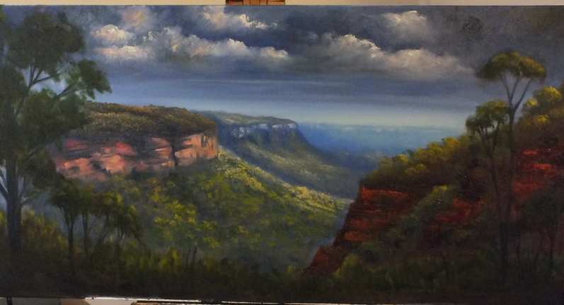
Nellies Glen Lookout

Couple of months ago, on a Sunday afternoon, we went for a short drive up to the Blue Mountains and somehow we ended up at a location known as Nellie's Glen. The place is very close to where Explorer's Tree is found, just before you enter Medlow Bath and where one also finds the beginning of the six foot track. The day was warm but cloudy with the occasional shower and thunderstorms, just a typical summer afternoon.What inspired me in the scenery was the intermittent light coming from the broken clouds, especially the warm afternoon light.
 
Materials used:
  • 45 x 90 cm stretched 10 oz cotton canvas
  • Brushes: Flat 10 - 12 for underpainting. A selection of long flats, 4,6,8 and long filberts 2 & 4
  • Oil paints (Art Spectrum, Landgridge, Norma), liquol for underpainting, Langridge Oleogel:
Titanium/zinc white, sap green, Burnt sienna, Australian red gold, Australian grey, raw and burnt umber
Blues: Ultramarine Blue, Cobalt blue, Manganese Blue
Reds: Permanent alizarin, Pilbara red, Vermilion, Indian red
Yellows: Lemon Yellow, cadmium yellow light,  cadmium yellow medium, cadmium orange, yellow ochre

Under-painting (Blocking in)
First I sketched briefly the outline of the main shapes in the painting. From the photos that I had as reference I completely changed the foreground of the painting by adding two trees one on each side of the painting. Using a very diluted wash with liquol the main shapes were blocked in. Liquol (Art Spectrum) is similar to liquin and helps the paint to dry very quickly.

Blocking in the main composition

The next step was to start establishing the form and light. As shown in the picture above initially I was going to place the light source as if it is coming from the right hand side (as seen by the highlights on the right front tree). However I changed the direction of the light later on to the middle part. Since the sky was pretty much grey and cloudy it was very difficult to see where the sun was. I also started adding some clouds using a mixture of ultramarine blue, permanent alizarin and raw umber. At this stage I use big flat brushes to quickly cover the canvas and avoid the temptation of fiddling too much. I also found that the colors I used initially for the underpainting were a little bit too light and so I darkened the overall picture, with the exception of where I wanted the highlights.


Establishing form and light


Mid- and fore-ground
Now the real work and fun started...adding the details. I wanted this painting to have lots of details, after all I love detail. From here on wards I used smaller brushes usually very long small filberts (Art Spectrum series 1100 brushes). These brushes are excellent, they keep their shape and they are relatively soft making it easy to apply layers of colors by softly touching the canvas. I started using the gel medium from Langridge, which gives more texture to the paint while at the same time makes the paint flow easier on the canvas. The rock formations on the right hand side were painted using a painting knife and a mixture of Pilbara red, ultramarine blue, vermilion and burnt sienna.
Cliff faces of distant mountains were painted using white and Pilbara red (tinted with more white for the most distant ones). Yellow was added to highlight objects directly hit by sun while for objects lit by day light, white was added to the base color.
As in any other painting, distant objects are less defined, lighter and cooler (more blue added) when compared to the ones closer to us. Nearby objects are well defined, darker and warmer.
I also used what is known as negative painting to define better objects like the front tree on the left. Using a slightly darker version of the sky (or background) colour, I painted over parts of the foliage to open up space and define more branches.
The finished painting


Sunday, December 14, 2014


Fingal Bay - the finished painting


Fingal Bay - NSW

In my last post I showed how I did the underpainting of this artwork using acrylics, on location. Using acrylics while on location has its own advantages and disadvantages. An advantage is that you can easily carry the painting with you while travelling because it dries quickly and so you can place it anywhere you like. On the other hand, if working in very warm conditions, excessive fast drying can be a disadvantage during the painting process itself.

So back to the studio I decided to finish this painting in oils. You can always work with oils over acrylics but not the other way round. I started from the sky, using cerulean blue and white with a  touch of alizarin crimson and raw sienna to the distant sky. I darkened the sky as I moved forward adding cobalt blue and alizarin to the right hand side corner and white and a touch of viridian to the left hand side corner from where the light is coming.

The distant land on the left was blocked with cerulean blue and highlights with raw sienna and white. The middle ground was blocked with cobalt and alizarin while the closest and mass on the right was blocked with ultramarine blue and alizarin with touch of yellow ochre to gray it. 

For the distant water I used ultramarine and phthalo blue and phthalo green, adding yellow and Australian red gold to the shallow water on the front. The detailes of the tress where painted using ultramarine blue mixed with yellow and a mixture of burnt sienna, viridian and Australian red gold. I added two sailing boats to the distance to cut the horizontal shoreline of Sharks Island in the distance. The wet sand on the fron was painted with yellow ochre mixed with burnt sienna and cerulean blue.


Thursday, November 13, 2014

'Plein Air' painting at Fingal Bay NSW

Above: Fingal Bay NSW

Above: under-painting done on location

Last Sunday was an excellent day to go to the beach and since for the last couple of days I was at Port Stephens, then I headed to Fingal Bay. It was early morning but the day was already hot and so I sat down and prepared my painting kit at a location overlooking the beach at Fingal Bay.

After choosing the scenery I started my underpainting using acrylic paints. Using cobalt blue I drew a very rough sketch consisting of the main shapes in the painting. Then I started putting layers of thin paint while adding more details. Cerulean blue and titanium white were used for the distant part of the sky while cobalt blue was added to the upper part and corners. Titanium white with a touch of alizarin red and raw sienna was used for the cirrus clouds. A mix of titanium white, cobalt blue and touch of raw sienna was used to block the most distant land mass, adding some more blue and alizarin crimson to the mid land mass (Shark Island). The closest land mass was blocked with ultramarine blue, vermilion and yellow ochre. A mix of alizarin and ultramarine blue was used as an underpaint to the sand.

The water was painted using ultramarine blue and touch of raw sienna with white at the background adding more blue to the middle water together with turquoise. More yellow ochre was added to the shallow water closer to the shoreline. The sand was painted using white and yellow ochre plus a touch of burnt sienna.

In the sun the acrylics were drying up in a matter of seconds and so I immediately started adding some more details and highlights to the distant land. The highlights were done by adding white to the base color and then adding naples yellow and touch of orange to the sunlit areas. The vegetation at the closest land mass was done using ultramarine blue, cadmium yellow and red gold. I briefly sketched in three sea gulls that at that time landed on the beach. However the day became too hot and so almost impossible to paint with acrylics. So I decided that I will take the sketch back to the studio to finish it.  I will post the finished work very soon.

Saturday, July 19, 2014

Oil painting - Near Warrenbungles

This is an oil on canvas I finished a week ago. The original photo was taken while on my way to Lightning Ridge and I was driving on a road crossing through the Warrenbungles National Park. 

The sky was painted using titanium white and raw sienna for the lower part and cerulean blue for the top and closer sky.
A mix of cobalt blue and permanent rose was used as an underpainting for the mountains (adding more titanium white to the distant mountain). The same mix was used to under-paint the mid-ground. Underpainting of the mid-ground trees was done using a darker mix by adding more cobalt blue and rose. The underpaint of the front three and ground was painted using a mix of ultramarine blue and burnt sienna.

Highlights on the mountain were done by adding white to the underpaint plus addition of lemon yellow for the side facing the sun. The same was done for the highlights on the trees to which I added raw sienna and cadmium orange.
The ground in the distance was painted using a flat brush and horizontal brush strokes with white, cadmium orange, lemon yellow and a touch of viridian.

As moving towards the foreground more viridian and yellow ochre were added for the ground. The grass at the front was painted witha painting knife using cadmium yellow, viridan and Australian red gold.

Highlights on the front tree were painted with cadmium yellow mixes with ultramarine blue and white. Details such as house and cows were added later on.


Sunday, June 15, 2014

Misty Gum Trees

gums Murray River
Original Photo


Misty Gums CVidal oil painting
Misty Gums, Oil on Canvas, 45 x 90cm

This is a painting I did some time ago from a photo I took of gum trees on the Murray river banks. The photo is a little bit dull and boring and so I wanted to create a vibrant painting out of it. For the composition I only used the four main gum trees and the setup next to the river in order to create reflections in the water. 

When coming to decide the colour scheme of this painting I chose the majority of my colours from the warm side of the colour wheel starting from yellow to red. Then I used two complements, ultaramarine blue (for the shadows) and green. 

I started by creating a gradient of colours in the background. Using a two inch house painting brush and a vertical brush stroke I applied titanium white to the right hand side of the canvas. From white I went to yellow, using raw sienna which when mixed with white gives a very bright background yellow. The next colour was vermillion to burnt sienna on the sides. Using vertical brush strokes I blended the colours to create a gradient. 

Using a mixture of burnt sienna and ultramarine blue I blocked in the darkest trees, river bank and water reflections. For the water reflections I initially used a vertical brush stroke, followed by a horizontal one to create a water effect. 

The background trees were painted using a vertical brush stroke, bottom to top with various values of vermillion mixed with burnt sienna. White and raw sienna was used for highlights. The highlights on the front trees were added using a painting knife and mixes of white with Naples yellow and vermillion. Water ripples were also added using pallette knife and a mixture of white and ultramarine blue. Grass on the river bank was painted using cadmium yellow light and ultramarine. Same colour tinted with white was used for foliage, together with cadmium yellow light and cadmium red medium.


Wednesday, June 11, 2014

Hanging Rock

This is an oil painting of hanging rock in Blue Mountains National Park.
I used two sets of colours, pallette 1 for the background and pallette 2 for the foreground.
Pallette 1: Titanium White, Cobalt blue, permanent crimson, raw sienna, manganese blue.
Pallette 2: Pilbara red, ultramarine blue, burnt sienna, Payne's grey, cadmium yellow medium

Step 1

Step 1
First I did a basic sketch using willow charcoal. Using a very diluted mixture of colour in odourless spirit, the upper part of the sky was painted with manganese blue and titanium white. Raw sienna was used for the yellowish part of the sky. An underpainting of the background mountains was done using cobalt blue and white, adding more blue and permanent crimson as I moved forward.

Step 2


Step 2
I blocked the main rock using a wash of burnt sienna and Payne's grey for the darkest shadows. I left the painting to dry overnight.

Step 3

Step 3
During this stage I add more detail and mid-tone colours. Clouds where painted using a mix of cobalt blue and crimson with white. The background cliffs where painted using white with a touch of cobalt blue and permanent crimson for the furthest ones. As I moved forward I eliminated the blue and added more crimson and also a touch of burnt sienna to the closest cliffs. 
Grass on the furthest cliffs was painted using raw sienna, white and a touch of sap green. The trees become greener as they come closer. 
The main rock formation was further developed using ultramarine blue, burnt sienna and Payne's grey.
Trees on the rock formation were blocked using ultramarine blue/vermillion, tinting it with white as moving backwards.

Step 4:


Step 4
More details and highlighting were added. At this stage I usually start from the main subject and then move to the less important parts and background. Pilbara red, cad yellow and vermillion were used for the main rock, creating texture using a painting knife. Highlights on the rock were done using white and Australian red gold. I then added highlights to the trees using cadmium yellow and Australian red gold, adding white as I moved to the background.


Wednesday, January 29, 2014

Afternoon ride

This is an acrylic on loose canvas showing a horse rider on top of a hill. Using willow charcoal I did a rough sketch of the main elements of this painting.

A mixture of titanium white with rose madder and cobalt blue was used to underpaint the furthest hill. A second mixture was prepared consisting of ultramarine blue, vermillion and white for the other background hills, increasing blue and vermillion to darken the colour as I moved forward to the closer hills. The foreground including trees were painted with viridian and burnt umber mix. Trees in the mid-ground were blocked by adding cobalt blue mixture to the foreground mixture, increasing blue as I went to the background trees.

After drying I prepared a wash of naples yellow with white for the background using diagonal brush strokes. I added trees using the same background blue colour. I started to add more details to the trees using raw sienna and yellow ochre. Light is coming from the right hand side corner.

Using a mix of yellow ochre or Naples yellow ith white I continued adding highlights to the trees and as I approached the front part of the painting I starting adding washes of alizarin red, red gold and viridian. Warm colours like vermillion, touch of cad red medium, cad yellow and ultramarine blue were used for the front trees and grasses. Then I highlighted the horse with combination of burnt sienna, cad orange and yellow/white mix. 

Additional details were added such as tree trunks and pure colours for highlights.

Friday, September 6, 2013

Understanding Colour

When white light, coming from the sun or another light source, strikes an object it is then reflected back to our eyes by that object. Different surfaces absorb, reflect and mix light differently due to their structures and this is why we see different colours. So in painting, different pigments on the surface of the canvas are able to do the same. There are 3 different properties in colour:
1. Hue: or the colour itself eg. Blue, red, yellow
2. Value: or else the darkness or lightness of colour and this is what creates contrasts
3. Intensity or tone: pure colour comes from the tube but it is rarely used as pure and so it has to be mixed. 
 

Hue

The above picture shows the colour wheel. There are 3 primary colours from which all the other colours can be mixed.....Yellow, red, blue.
Secondary colours are those mixed from two of the primaries eg: blue + yellow = green
Tertiary colours are those mixed from a secondary and a primary eg: orange + yellow
Colours are said to be either warm or cool. Red is warm while blue is cool.
However there are warm blues (eg: ultramarine blue) and cool blues such as cerulean, cobalt and phtalo blue. There are also warm reds such as the cadmiums and cool reds (alizarin red).
The earth colours such as raw sienna, raw umber, burnt sienna and burnt umber are located at the inner part of the wheel towards the orange side.
Using cool colours for early morning scenes as well as for winter scenes while warm colours are used for afternoon or summer/Autumn scenes.
Appropriate use of warm and cool colours in a painting will give you depth and perspective, that is using blues for distant objects such as distant mountains and warm colours for foreground objects.

Value

The darkness and lightness of colour will give contrast and hence also useful for perspective. White is the lightest colours while black is the darkest...however black is rarely used in a painting as it is too strong (use Payne's grey instead). The addition of white to a colour will create a tint. Always keep an abundant amout of white available to use. Colours are usually darkened with a grey to create a tone. The addition of white or greys will affect the intensity of the colour. Adding black will create shade.

Suggestions applicable for oil painting

Always use artist quality oil paints (these contain more pigment and so do not fade when mixing). Also it will be easier to create texture when using knife for painting. You cannot work well with runny colours.
If oil colours are too thick then thin them with gum turpentine or linseed oil, only to a creamy consistency. The more oil you add the more time it takes for the painting to dry. Gum turpentine is usually added to colours used for the underpainting for fast drying.
Add more oil to the top layers of a painting as these has to dry the last., this is known as FAT over LEAN. If upper layers dry before the lower ones then this can cause cracking. Always paint in adequate ventilation as oil colours are toxic even if they do not smell. When starting painting, start from very dark (usually monochrome) underpainting, just indicating the basic shapes and structures and light/dark areas. Always keep in mind that there is no light if there is no dark and so you have to create contrast by putting highlights over darker areas. I will give more details how to use colours when discussing landscape painting.