Showing posts with label composition. Show all posts

Sunday, December 18, 2016

Painting the Outback in Oils

Painting the outback.

Ayer’s rock, or as it is known “Uluru” is not only one of Australia’s major landmarks but also it is one of the most sacred and important aboriginal sites. I travelled to the “Red Centre” of Australia in the Northern Territory couple of years ago, and visited some of the most beautiful places I’ve been to so far.

In this painting I wanted to show the vastness of the land with this massive sandstone monolith occupying a dominant position in the painting. A big sky will complement the subject.  


Above is one of the reference photos I used for this painting. I also prepared some sketches (to scale with the canvas) and then I chose the one that I liked most. Following that on my notebook I did some planning of the colors to use and of the various color values. To do this I use a value comparative which helps me a lot to judge my values correctly. My aim is that during the first phase of the painting I get as much as possible close to the end product in what has to do with values and color. Then when the canvas is entirely covered with paint I will be able to judge by comparing one color to the other next to it and adjust accordingly.

For myself the first stage of the painting is the most important one and most labour intensive. By the end of this stage I will need to have all the canvas covered with paint and establish shapes and form of most of the elements. I also try to get as close as possible to the right tones and values. By the end of this stage I want to see most of the painting only lacking detail and minor adjustments. Since the sky plays a very important role in this painting, I decided to start from the sky by blocking in the clouds leaving empty spaces for the sky. For the sky I usually use an old big brush so that I can literally scrub the paint all over. When painting the sky I try not to paint it as a solid object always keeping in mind that I am painting air. 

The next step was to block in the foreground and the rock itself. The main rock formation was painted using a mixture of cobalt/ultramarine blue, white and Quinacridone Magenta. Using a cloth I softened edges and lifted paint of to expose the underpaint while establishing where to place the highlights in the next step. 


 The next stage was to start adding the details. Using various mixtures of white with burnt sienna, cadmium scarlet, alizarin, yellow ochre and ultramarine blue, I gave more form and detail to the ground at the front and middle parts of the painting, giving the impression of cracked ground washed away by water. More form, details and highlights were added to the trees and bushes all across the painting. Using a warm and cooler version of the base mixture described above the details and highlights were added to Ayer’s Rock. Reflected light from the sky was painted using a mixture of white with ultramarine blue.  
Gradually I always do some minor adjustments and add more details during the first couple of weeks until I see that there is nothing else to add. 


Tuesday, August 18, 2015

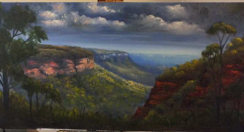
Nellies Glen Lookout

Couple of months ago, on a Sunday afternoon, we went for a short drive up to the Blue Mountains and somehow we ended up at a location known as Nellie's Glen. The place is very close to where Explorer's Tree is found, just before you enter Medlow Bath and where one also finds the beginning of the six foot track. The day was warm but cloudy with the occasional shower and thunderstorms, just a typical summer afternoon.What inspired me in the scenery was the intermittent light coming from the broken clouds, especially the warm afternoon light.
 
Materials used:
  • 45 x 90 cm stretched 10 oz cotton canvas
  • Brushes: Flat 10 - 12 for underpainting. A selection of long flats, 4,6,8 and long filberts 2 & 4
  • Oil paints (Art Spectrum, Landgridge, Norma), liquol for underpainting, Langridge Oleogel:
Titanium/zinc white, sap green, Burnt sienna, Australian red gold, Australian grey, raw and burnt umber
Blues: Ultramarine Blue, Cobalt blue, Manganese Blue
Reds: Permanent alizarin, Pilbara red, Vermilion, Indian red
Yellows: Lemon Yellow, cadmium yellow light,  cadmium yellow medium, cadmium orange, yellow ochre

Under-painting (Blocking in)
First I sketched briefly the outline of the main shapes in the painting. From the photos that I had as reference I completely changed the foreground of the painting by adding two trees one on each side of the painting. Using a very diluted wash with liquol the main shapes were blocked in. Liquol (Art Spectrum) is similar to liquin and helps the paint to dry very quickly.

Blocking in the main composition

The next step was to start establishing the form and light. As shown in the picture above initially I was going to place the light source as if it is coming from the right hand side (as seen by the highlights on the right front tree). However I changed the direction of the light later on to the middle part. Since the sky was pretty much grey and cloudy it was very difficult to see where the sun was. I also started adding some clouds using a mixture of ultramarine blue, permanent alizarin and raw umber. At this stage I use big flat brushes to quickly cover the canvas and avoid the temptation of fiddling too much. I also found that the colors I used initially for the underpainting were a little bit too light and so I darkened the overall picture, with the exception of where I wanted the highlights.


Establishing form and light


Mid- and fore-ground
Now the real work and fun started...adding the details. I wanted this painting to have lots of details, after all I love detail. From here on wards I used smaller brushes usually very long small filberts (Art Spectrum series 1100 brushes). These brushes are excellent, they keep their shape and they are relatively soft making it easy to apply layers of colors by softly touching the canvas. I started using the gel medium from Langridge, which gives more texture to the paint while at the same time makes the paint flow easier on the canvas. The rock formations on the right hand side were painted using a painting knife and a mixture of Pilbara red, ultramarine blue, vermilion and burnt sienna.
Cliff faces of distant mountains were painted using white and Pilbara red (tinted with more white for the most distant ones). Yellow was added to highlight objects directly hit by sun while for objects lit by day light, white was added to the base color.
As in any other painting, distant objects are less defined, lighter and cooler (more blue added) when compared to the ones closer to us. Nearby objects are well defined, darker and warmer.
I also used what is known as negative painting to define better objects like the front tree on the left. Using a slightly darker version of the sky (or background) colour, I painted over parts of the foliage to open up space and define more branches.
The finished painting


Friday, June 5, 2015

Last Lights on Tumut Valley


Step 1
This is one of the most recent paintings showing Tumut Valley in NSW. What attracted me to paint this scenery was the game of warm light and shadows through the whole view. The linen board was primed for oil painting and underpainted with a tint ultramarine blue and burnt umber.
Materials used:
  • 60 x 30cm linen board
  • Brushes: Long Flat brushes 12, 10, 8, 4, 2 liners (0, 00), Very long filberts (2, 6) (Art Spectrum Series 1100KLF)
  • Odourless mineral spirit +  Liquol (Art Spectrum)
  • Color palette: Titanium and zinc white, French Ultramarine Blue, permanent alizarin, viridian, sap green, burnt sienna, raw sienna, , raw umber, Flinders red violet, Australian red gold (Art Spectrum), Cobalt blue deep, yellow ochre (Norma Professional), Van Dyke brown, ultramarine rose, cadmium yellow light, medium, deep (Masterclass), cadmium orange (Old Holland) and lemon yellow (Michael Harding)
Under-painting (Blocking in)
I wanted to start off this painting over a very dark underpainting, so using a number 12 flat brush I blocked in the sky with a mixture of Flinders red violet and French ultramarine blue.
Cobalt blue was used to block in the background mountains, adding permanent alizarin and a touch of yellow ochre to the closer mountains.
The middle ground including trees was blocked in with a mixture of French ultramarine blue, permanent alizarin and yellow ochre. The foreground is the darkest part and so I used  a mix of French ultramarine blue and Van Dyke Brown for the ground and Van Dyke Brown with viridian for the trees.


Step 2
The next step was to start giving more form to the relatively abstract underpainting. Using number 10 and 8 flat brushes I started adding more clouds using titanium white mixed with touches of permanent alizarin, lemon yellow and yellow ochre. Dark areas in the clouds were darkened with ultramarine blue, alizarin and raw umber. I gave importance to create contrast between the darkest and brightest parts of the clouds using complementary colors. The distant sky was lightened up using a tint of cerulean blue with lemon yellow added to the left hand side of the painting, the side from where light is coming.
The mountains were given more shape by darkening the shadows. The highlights in shadows were painted using a tinted underpaint. The areas lit by the sun on the mountain were painted with a tint of lemon yellow and a touch of permanent alizarin + yellow ochre.


Finished painting

Mid- and fore-ground
A mixture of ultramaine blue and yellow ochre was used to paint most of the ground and trees in the middle-ground. The ground is darker and cooler (with the addition of more ultramarine blue) as you move to the right of the painting since light is coming from the left. Parts of the underpaint was not painted over to give the illusion of shadows, that at that time of the day are very long. The mixture was tinted slightly as one moves into distance. The areas that are hit directly by sunlight where highlighted with the addition of yellow ochre and some lemon yellow in the mid ground. The trees were painted with darker shade of the same color used for the ground.
For the foreground used the same base color of ultramarine blue and yellow ochre with the addition of a warmer yellow for the highlights. I used different mixtures cadmium yellow deep, medium and light or/and Australian red gold with sap green, sap green and burnt sienna or permanent alizarin. The details were added gradually over a number of days, thus allowing the previous layer to dry. For most of my painting I used liquol which dries very quickly but for the final highlights and details, paints were used without the addition of any medium. During each session I continued to enforce the dark shadows and adjusting the saturation, hues and values of the highlights.


Sunday, December 14, 2014


Fingal Bay - the finished painting


Fingal Bay - NSW

In my last post I showed how I did the underpainting of this artwork using acrylics, on location. Using acrylics while on location has its own advantages and disadvantages. An advantage is that you can easily carry the painting with you while travelling because it dries quickly and so you can place it anywhere you like. On the other hand, if working in very warm conditions, excessive fast drying can be a disadvantage during the painting process itself.

So back to the studio I decided to finish this painting in oils. You can always work with oils over acrylics but not the other way round. I started from the sky, using cerulean blue and white with a  touch of alizarin crimson and raw sienna to the distant sky. I darkened the sky as I moved forward adding cobalt blue and alizarin to the right hand side corner and white and a touch of viridian to the left hand side corner from where the light is coming.

The distant land on the left was blocked with cerulean blue and highlights with raw sienna and white. The middle ground was blocked with cobalt and alizarin while the closest and mass on the right was blocked with ultramarine blue and alizarin with touch of yellow ochre to gray it. 

For the distant water I used ultramarine and phthalo blue and phthalo green, adding yellow and Australian red gold to the shallow water on the front. The detailes of the tress where painted using ultramarine blue mixed with yellow and a mixture of burnt sienna, viridian and Australian red gold. I added two sailing boats to the distance to cut the horizontal shoreline of Sharks Island in the distance. The wet sand on the fron was painted with yellow ochre mixed with burnt sienna and cerulean blue.


Thursday, November 13, 2014

'Plein Air' painting at Fingal Bay NSW

Above: Fingal Bay NSW

Above: under-painting done on location

Last Sunday was an excellent day to go to the beach and since for the last couple of days I was at Port Stephens, then I headed to Fingal Bay. It was early morning but the day was already hot and so I sat down and prepared my painting kit at a location overlooking the beach at Fingal Bay.

After choosing the scenery I started my underpainting using acrylic paints. Using cobalt blue I drew a very rough sketch consisting of the main shapes in the painting. Then I started putting layers of thin paint while adding more details. Cerulean blue and titanium white were used for the distant part of the sky while cobalt blue was added to the upper part and corners. Titanium white with a touch of alizarin red and raw sienna was used for the cirrus clouds. A mix of titanium white, cobalt blue and touch of raw sienna was used to block the most distant land mass, adding some more blue and alizarin crimson to the mid land mass (Shark Island). The closest land mass was blocked with ultramarine blue, vermilion and yellow ochre. A mix of alizarin and ultramarine blue was used as an underpaint to the sand.

The water was painted using ultramarine blue and touch of raw sienna with white at the background adding more blue to the middle water together with turquoise. More yellow ochre was added to the shallow water closer to the shoreline. The sand was painted using white and yellow ochre plus a touch of burnt sienna.

In the sun the acrylics were drying up in a matter of seconds and so I immediately started adding some more details and highlights to the distant land. The highlights were done by adding white to the base color and then adding naples yellow and touch of orange to the sunlit areas. The vegetation at the closest land mass was done using ultramarine blue, cadmium yellow and red gold. I briefly sketched in three sea gulls that at that time landed on the beach. However the day became too hot and so almost impossible to paint with acrylics. So I decided that I will take the sketch back to the studio to finish it.  I will post the finished work very soon.

Monday, August 18, 2014

Fire and Water - Abstract painting


Acrylic colors used (Atelier and Matisse): 

Alizarin red, cadmium red medium, phtalo blue, ultramarine blue, Naple's yellow, cadmium yellow medium, titanium white 

Brushes:

A normal 2 inch house painting brush, brushes used to apply gesso, a painting knife

Methodology:

This was a very simple abstract I did recently on stretched canvas. I started by placing directly on the canvas ultramarine blue, alizarin and Naple's yellow. Using a 3 different brushes (one for each color) I started spreading the three colors on the canvas mainly at three distinct areas, blue at the bottom right corner, red the upper left and yellow the central to upper right corner. Carefully I started blending the colors together to create the secondaries i.e. green, purple and orange, leaving some areas of pure primary color. I left the colors to dry for couple of minutes  and then I started applying cad red, cad yellow and phtalo blue onto the previous layer using bold brush strokes and applying circling motion depending on how I was seeing the colors developing. I left untouched brush strokes that looked good to the eye or any secondary or tertiary colours that appeared by co-incidence. 
To finish off the painting I took a piece of tissue and placed it in titanium white and I applied it to some areas as a highlight. Using a painting knife I mixed blue, yellow and white and  I applied vertical strokes to the right bottom corner to look like reflections of color.


Thursday, July 31, 2014

How to make your own glass palette

Glass palette


During the last couple of years I tried several different kinds of palettes that are available on the markets starting from the traditional wooden ones to the most recent disposable ones. Depending on the situation and where I am painting all types of palettes have their own pros and cons. For example I find disposable palettes convenient because I do not need to clean my palette afterwards, but they are very inconvenient if I am painting in the wind. When I do not have a lot of space where to work and put things around me I usually use a big piece of perspex which fits exactly into my French easel and so I can leave the colors on it ready for the next session or even put in the freezer to be used couple of days after.

Recently I decided to start using a glass palette, that is big in size and that I can take with me when I go to workshops and painting outside. The size of the palette is approximately 55 x 35cm and it is simply made up of a piece of normal glass painting at the back in grey with acrylics. The grey color helps you to see the colors much better since it reduces reflections. From the local store I bought the wood and piano hinges I required to build the wooden case myself. I then fitted this piece of glass into a home-made wooden box which I can close and lock when it is not in use and during transport. When open I can place the whole box on the drawer of my French easel. The open lids serve as small side tables on which I can place my colors, mixing media and brushes. I also fitted a wooden brush holder on the side.

When ready I simply transfer all the brushes into my French easel, place colors in their box and clean the mixing surface with a clean tissue or cloth. Being made up of glass makes it very easy to clean. The advantage of a big palette is a larger mixing area as well as enough space to place your colors around. I always place my colors in the same order as they are on the color wheel, that is reds on my left, blues on my right and yellows in front of me.

For more information about this easel please do not hesitate to ask or contact me.

Saturday, July 19, 2014

Oil painting - Near Warrenbungles

This is an oil on canvas I finished a week ago. The original photo was taken while on my way to Lightning Ridge and I was driving on a road crossing through the Warrenbungles National Park. 

The sky was painted using titanium white and raw sienna for the lower part and cerulean blue for the top and closer sky.
A mix of cobalt blue and permanent rose was used as an underpainting for the mountains (adding more titanium white to the distant mountain). The same mix was used to under-paint the mid-ground. Underpainting of the mid-ground trees was done using a darker mix by adding more cobalt blue and rose. The underpaint of the front three and ground was painted using a mix of ultramarine blue and burnt sienna.

Highlights on the mountain were done by adding white to the underpaint plus addition of lemon yellow for the side facing the sun. The same was done for the highlights on the trees to which I added raw sienna and cadmium orange.
The ground in the distance was painted using a flat brush and horizontal brush strokes with white, cadmium orange, lemon yellow and a touch of viridian.

As moving towards the foreground more viridian and yellow ochre were added for the ground. The grass at the front was painted witha painting knife using cadmium yellow, viridan and Australian red gold.

Highlights on the front tree were painted with cadmium yellow mixes with ultramarine blue and white. Details such as house and cows were added later on.


Saturday, March 8, 2014

Painting with acrylics and oils

Today I am writing about a recent painting I finished of another Australian landscape.

I started this painting from the above reference photo, which I took while vacationing at snowy mountains very close to Thredbo, almost two years ago. This photo has very nice background mountains but the foreground is not that inspiring. However I decided to keep the basic shapes while modifying the colour scheme and adding gum trees to the foreground. Using charcoal I did a rough sketch of the main forms to define the background, middle and foreground. I added a farmhouse at the far end of the middle ground.


I started the painting by executing an underpainting with acrylic colours to establish the basic forms as well as the mood of the painting.


I decided to paint an early morning scene and so I chose a pallette of warm oranges and yellows and cool blues for the background. I then removing some trees and the road that was originally winding uphill in distance. The advantage of using an acrylic underpainting is that it dries very quickly although you can achieve the same result if you had to dilute oils with mineral spirit.

Next step was to go for a layer of oil colour to enforce the shadows and mid-tones in the painting. Colours used were titanium/zinc white, cobalt blue, ultramarine blue, alizarin crimson, cerulean blue, yellow ochre, cad orange, burnt sienna, Australian red gold, virmillion, burnt umber, sap green, viridian,cad yellow light.


The final stage was to add the details and highlights, using both brushes and pallette knives. The final product can be seen above.

Wednesday, January 29, 2014

Afternoon ride

This is an acrylic on loose canvas showing a horse rider on top of a hill. Using willow charcoal I did a rough sketch of the main elements of this painting.

A mixture of titanium white with rose madder and cobalt blue was used to underpaint the furthest hill. A second mixture was prepared consisting of ultramarine blue, vermillion and white for the other background hills, increasing blue and vermillion to darken the colour as I moved forward to the closer hills. The foreground including trees were painted with viridian and burnt umber mix. Trees in the mid-ground were blocked by adding cobalt blue mixture to the foreground mixture, increasing blue as I went to the background trees.

After drying I prepared a wash of naples yellow with white for the background using diagonal brush strokes. I added trees using the same background blue colour. I started to add more details to the trees using raw sienna and yellow ochre. Light is coming from the right hand side corner.

Using a mix of yellow ochre or Naples yellow ith white I continued adding highlights to the trees and as I approached the front part of the painting I starting adding washes of alizarin red, red gold and viridian. Warm colours like vermillion, touch of cad red medium, cad yellow and ultramarine blue were used for the front trees and grasses. Then I highlighted the horse with combination of burnt sienna, cad orange and yellow/white mix. 

Additional details were added such as tree trunks and pure colours for highlights.

Thursday, January 23, 2014

Waterfall painting

This painting shows one of the waterfalls found on one of the tracks in Blue Mountains. My favorite bush walks are those deep in the rainforests surrounded by ferns and where light seldom reaches. Waterfalls, creek and small rock pools continue to enhance the landscape. This is what inspires me most, the effect of light, water and water reflections.

This painting is an acrylic on canvas. I used a technique which is more impressionistic since it lacks the fine details of realism. I light source is coming from the right upper corner. I started by a simple wash of the main colours as an underpainting, using titanium white and Naples yellow for the lighting. Cerulean blue and white was used for the distant rock underpainting adding raw sienna to it to create tints of green for the vegetation. A mix of ultramarine blue, white and vermilion was used for the underpainting of the main rock for the waterfall, adding more blue and red to darken it as I moved closer to the front. Using the same colours plus burnt sienna and burnt umber I pained the foreground using horizontal brush strokes.

After drying I added more layers of paint to the light source and to the background rocks by mixing white with touches of alizarin red and burnt sienna to create the rocks. I added more details and colour to the vegetation by using a mixture of Naples yellow, cerulean blue and olive green for the mid-tones. I added highlights with increasing amounts of white and Naples yellow, using a dabbing stroke of a flat brush.
With dry brush I scrubbled the mist below the vegetation using a mixture of white and cobalt blue.
The vegetation on the left hand corner was painted using a mixture of greens darkened by its complementary colour alizarin red.

Then I started adding details to the rock. Using a pallette knife as well as brush I started adding mid-tones using a mixture of white, alizarin red and burnt sienna. The closer to the front of the painting the more burnt sienna was used. After drying I started adding highlights using white and naples yellow to the rock. I also prepared a wash of phtalo green with raw sienna and Naples yellow and with very soft touches I started adding some green colour to the rocks. Using the same wash that I used for the mist, I added some mist to the back part of the rock.

Using the same mixes of greens and burnt sienna I strted adding reflections to the ground, using horizontal brush strokes. The water was done using dry brushes with mixtures of white plus cobalt blue. Highlights with white and Naples yellow using a very small (0) round brush and intermittent brush strokes.

A wash of white and cobalt blue was used to give the impression of water on the ground. I then added different greens a mixture of yellows and red gold to add some vegetation to the rocks especially to the front part of the painting.

Friday, November 1, 2013

Using Colours - mixing and characteristics


Placing colours on the pallette

When you decide which colours to use in the painting you are planning to do, you can place an amount from each colour from the tube onto the pallette. Always try to keep the same order of how you place the colours, usually using the order of the colour wheel. I usually place the colours in the order starting from reds on the left hand side, yellows and blues on the right hand side. I place White on the right hand side and browns just after the reds. Always place the colours on the upper part of the pallette and leave a lot of space for mixing colours.

Diluting colours

Most of the time we will need to dilute colours since they are usually too thick to use directly from the tube. You thin the colours by using one of the several media that are available. However for oil colours the most common diluents used are pure gum terpentine, odourless mineral spirits and refined linseed oil.
Since you want the underpainting to dry very quickly the best to use are odourless spirits or pure gum terpentine. I prefer the former due to lack of odour. You can dilute the paints either by dipping the brush in the mdium before picking the colours obviously adding amount of mineral spirit depending on what you want to achieve. The more diluent you add the thinner the paint and the more it dries quickly. This is good to do a wash for the underpainting. You can thin the colour especially white by adding drops of diluent onto it while mixing with painting knife until the paint has a consistency like a toothpaste.
For the next layer of paint I will dilute using a mix of 1:4 linseed oil with mineral spirit.
To decrease the drying time it is also wise to use liquin which decreases drying to almost 1/3 of the normal time.
In the case of acrylics usually you dilute with water or else one of the several media available that usually are used to increase drying time since acrylics dry very quickly especially in hot and dry conditions.

Drying Times

Different oil colours have different drying times. This is because oil colours do not dry by evaporation but by oxidation. Here are some examples:
Fast drying times (1 - 2 days) cobalt blue, Prussian blue, Raw sienna, umbers, Flake white
Medium drying times (5 days) permanent alizarin, cadmiums, ultramarine blue, ochres, burnt sienna, titanium white, zinc white
Long drying time (> 5 days) acrylamides, alizarin crimson, quinacridones

Use of colour in landscape painting

In order to create the illusion of distance as well as other characteristics such as time of the day or seasonal variations one has to know which colours to use in a landscape. As a general rule, very cool colours will recede in distance while warm colours appear to be at the foreground. However there are different blues, reds and yellows available that can in themselves be warm or cool. Here are some examples:

  • Cobalt and cerulean blues are cool blues very good for skies and distant objects especially when mixed with white. Add crimson as you move closer (turning purple) and a touch of raw sienna to change it to grey.
  • Ultramarine blue is a warmer blue and can be used for objects that are closer
  • Alizarin crimson is a cool red and so it is ideal for backrounds, to darken mountains and other objects as they come closer and to create shadows in the clouds or purplish colours in the skies. When mixing will alizarin crimson be cautious as the colour is very intense and you will only need to use very small amounts
  • Cad red, vermillion are warm reds with cadmiums being the warmer, so usually these are used for nearby objects
  • Cadmium yellow or orange are warm while lemon yellow is a cool colour. For background yellows or greens one can use raw sienna which can look yellow especially when mixed with white
  • Vermillion is a pure and very intense green but rarely used on its own due to its strong and artificial looking colour. You can use touches of vermillion mixed with other colours such as raw sienna to give a green tint.
  • Burnt umber can be used for foreground and the same for burnt sienna. Burnt umber creates an interesting green when mixed with veridian
  • Always try to darken a colour by using the opposite colour (complementary) on the colour wheel.
  • Indian yellow or Australian red gold forms a bright yellow (golden) when mixed with white.

Tuesday, October 15, 2013

Composition 3 - Oil Painting Landscape

Composition 3 - The Three Sisters


This is a painting I recently finished showing the iconic Three Sisters at the Blue Mountains. This is an oil on canvas board. I used 10oz cotton canvas on MDF board.
I am going to use this painting to go through the basic techniques of landscape painting. 
To start with, most landscape paintings have a background which usually includes the sky. The furthest mountains in this painting are part of the background. 
The midground refers to the closer mountains and the rock formations themselves.
The foreground at the bottom of the painting is the closest to the viewer.
To create the sense of distance and depth one has to use colour and also relationship of different objects to each other, i.e. the closer the subject is to you it looks bigger, more detailed and darker in colour.
Aerial perspective. When you look at a distant object like looking at mountains that are kilometers away, one tends to see them having a bluish colour. This is because there is atmosphere between the mountains and the viewer and this atmosphere is made up of gasses and humidity that scatters light coming from the sun while absorbing most colours leaving only blue to reach your eyes. So in a painting we need to create this effect. In the morning since there are more water droplets in the atmosphere the bluish colour seems to be stronger.
I started the painting with a rough sketch and underpaint using a wash of basic colours. I diluted the paints with odourless mineral spirit for fast drying.The underpainting was done using cobalt blue and titanium white for sky and background mountains, adding more alizarin crimson to the forground mountains and rock formations and dark burnt umber for the forground rocks.

Backround.
As a diluent for the rest of the painting I used a mix of 1:4 linseed oil with odourless mineral spirit.
After the first wash I left the painting to dry overnight. The next day the paint was almost completely dry.
Using a mix of titanium/zinc white I started from below the horizon line up into the sky. The distant sky has to be close to white. Cobalt blue was used for the upper part of the sky, darker at the corners and using a criss-cross brush stroke blended into the white of the distant sky creating a gradient.
The cloud was painted using a purplish shadow from cobalt blue and alizarin red. Using a 8 filbert brush I added the white highlights with a touch of burnt sienna, blending the colour into the shadow in a circular movement. Using a clean dry brush I softened the brush strokes using a diagonal brush stroke up into the right hand corner. The horizontal distant mountain at the horizon was done using a single brush stroke with cobalt blue onto the white underpaint. The lower part within the valley was left as white as possible to give the illusion of mist.
Midground
Using a mix of ultramarine blue + titanium white with a touch of alizarin I created the background mountain on the left hand side. Adding more blue and slightly more alizarin red I did the other mountain on the left hand side just behind the rock formations.
To the same mix I added slightly more ultra blue and more alizarin crimson creating a reddish purple. With this mix I painted the right hand side middle mountain.
The underpaint of the three sisters was painted using a mix of ultramarine blue + white + vermillion.
I started adding the details to the background mountains. The cliffs were painted with a mix of white with a touch of alizarin. I added a touch of very lemon yellow mix with white to the mountain behind the three sisters giving the hint of trees. The cliffs on the right handside mountain where painted with titanium white + alizarin + touch of burnt sienna (not completely mixed but left as marbled).
Using a mix of titanium white + raw sienna I started adding the grass and hint of trees to the right hand side mountain. The highlights were done by adding more white to the raw sienna. Using a filbert brush I added more trees from back to front, enhancing the brush stroke and leaving shadows from teh underpaint in between them. Using a liner brush and a mix of blue/white I added the tree trunks randomly throughout, increasing the size as I come forward.
The rock formations of the tree sisters were painted using a mix of white + alizarin + more burnt sienna partially mixed. I used a flat brush and a small painting knife to create the rock effect.
The trees around the three sisters were painted using a filbert brush loaded with a mix of titanium white + raw sienna + gray (made up of alizarin + ultramarine blue + touch of raw sienna) + very tiny spec of viridian green. Highlights were added randomly using a mix of white with Australian red gold (or if you want Indian yellow).
Foreground
Using a painting knife I sculptured the rock formation at the forground using a very dark mix of burnt umber, Payne's gray + burnt sienna. I partially mized these colours with titanium/zinc white and using the knife strokes in the direction the rocks are positioned. The shadow of the cliff edges was left with Payne's gray and burnt umber. I added a little bit of green colour (ultramarine blue and cadmium yellow medium) to the rock and also a touch of vermillion (red).
The bush was painted with the same mix of Payne's gray, burnt umber and viridian green. Highlights of the bush was painted with cadmium yellow medium, Australian red gold, white mix. I used pallette knife for most of the foreground including tree trunk of bush as it creates a really nice bold effect.

Hope you enjoy and that you found this information usefull.
Happy painting


Sunday, September 8, 2013

Landscape Painting - Composition 1

It is very important that you find a subject to paint and you should direct all attention of the viewer towards your subject. The subject could be a house or a particular tree, or what ever you find interesting and want to show to your audience. You might be painting from photos or plein air, in both cases you should have something that attracted you to paint that particular scene and so you want it to be the subject of your painting.

Usually the subject is not placed at the centre of the painting  but somewhere in the lower quadrant on the right hand side of the painting (Fig 1). The human eye tends to travel more from left to right and you want to leed the viewer's eye into the picture and towards that subject.

As shown above, the canvas was divided into four quadrants and the subject was placed in the lower right hand side quadrant. However although this model is used quite often, this is not a rule. There are other ways of constructing a good composition. The most important is not to place the subject at the centre of your painting. The subject can also be anything or it could simply be an area of very bright light as in the image below.

To keep the viewer's eye in the picture and leading it to the subject it is important to place secondary objects pointing towards the subject. As in the painting above the path is leading towards that light and into the unknown. You can have branches, trees, a winding road etc to do this job. Never place objects facing out of the picture as this will distract the viewer's eye and will leed it out of the picture.

Aother issue to be considered is the viewpoint or whether you are looking at your subject at level or like you are looking at it from over the top of a hill (facing down). When looking from above you will see more objects into distance than if you are looking at level. So high viewpoint paintings will usually include less sky and more land, however it is challenging to demonstrate the effect of distance. If looking at level, then usually you will have more sky and objects at the back are partly or almost completely covered by those at the front.